case study

peers. - revamp user onboarding
Case study
I was tasked with redesigning the user onboarding experience. The primary objectives were to improve user engagement, reduce the churn rate, and increase product adoption. This was to be achieved by incorporating personalized experiences and providing clear, step-by-step guidance to new users.
Company
peers.
Industry
HealthTech / Mental health
Funding
€€€ Pre-Seed
About
Peers is a groundbreaking digital mental health platform that offers expert psychological support in unique online groups, eliminating wait times. Their AI-based matching algorithm ensures optimal group matches for enhanced support.
Starting state
The initial user onboarding process was developed by a design consultant. Our first step was to thoroughly analyze the existing design and evaluate tracking data to identify areas for improvement.
Initial user onboarding
Individual pain points
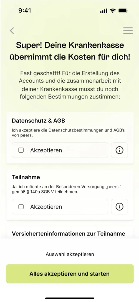
The initial onboarding process was complicated by several specific pain points that made it overly complex. A particularly challenging aspect was the intricate questionnaire designed to provide professional course recommendations. Additionally, we needed to request sensitive information, such as health insurance details, to verify if courses could be covered by one of our partner insurers, potentially making them free for the user.
These complexities resulted in numerous edge cases that unnecessarily inflated the onboarding process. Our task was to simplify these elements, ensuring that the necessary information was collected in a user-friendly manner, while still providing a seamless and straightforward experience for our users.
Furthermore, our partnerships with health insurance companies required compliance with numerous data protection regulations and multiple opt-in options, adding complexity to the onboarding process.
General pain points
1. Confusing Interface / Mobile unfriendly
The app interface is cluttered or unintuitive, users may struggle to understand how to navigate through the onboarding process. It has also not been optimised for mobile devices.
2. Forced Registration
Requiring users to register before they can even explore the app's features can be off-putting. Allowing users to explore as guests first can improve the onboarding experience.
3. Lack of Guidance
Users may feel lost without proper guidance during onboarding. Clear instructions and and designing according to proven ux laws, for example that the main button is positioned within the thumbzone.
4. Lack of Personalization
Generic onboarding experiences that don't take into account users' preferences or needs feel impersonal and disengaging.
5. Unclear Value Proposition
If users don't understand the value or purpose of the app during onboarding, they may lose interest and drop off.
6. Technical Glitches
Since we used Flutter to build the app back then, we had extreme problems with the loading time.
Onboarding > Start page
100%
——

> Create Account - Email
72%
27,56% dropped off

> Create Account - Password
47%
34,72% dropped off
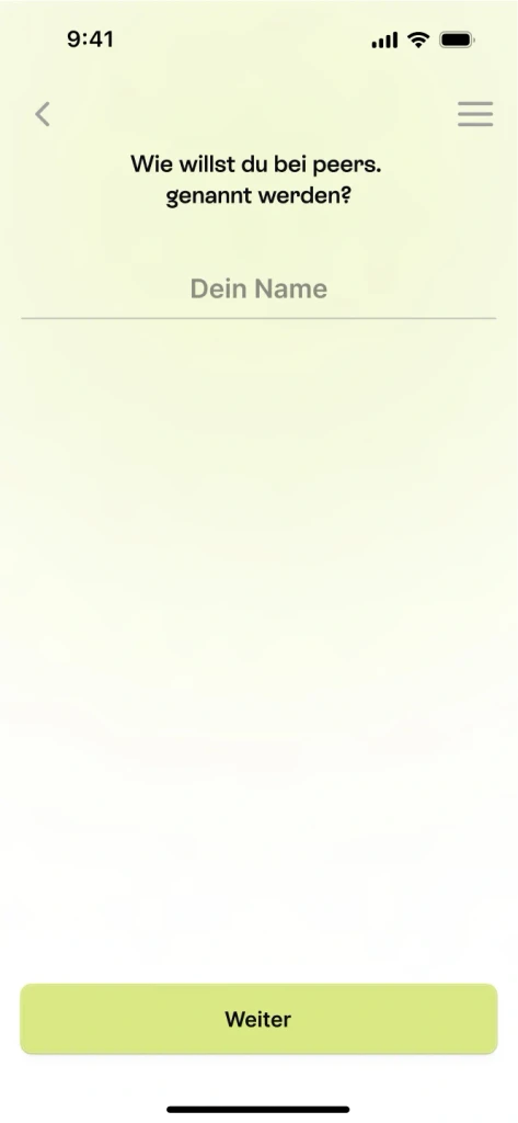
> Name
45%
04,23% dropped off

> Gender
44%
02,57% dropped off
> Starting questionnaire
36%
17,88% dropped off
> While questionnaire
25%
19,67% dropped off

> Choose abo
14%
11,72% dropped off
> Payment page / Stripe
2,7%
74,64% dropped off
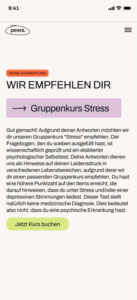
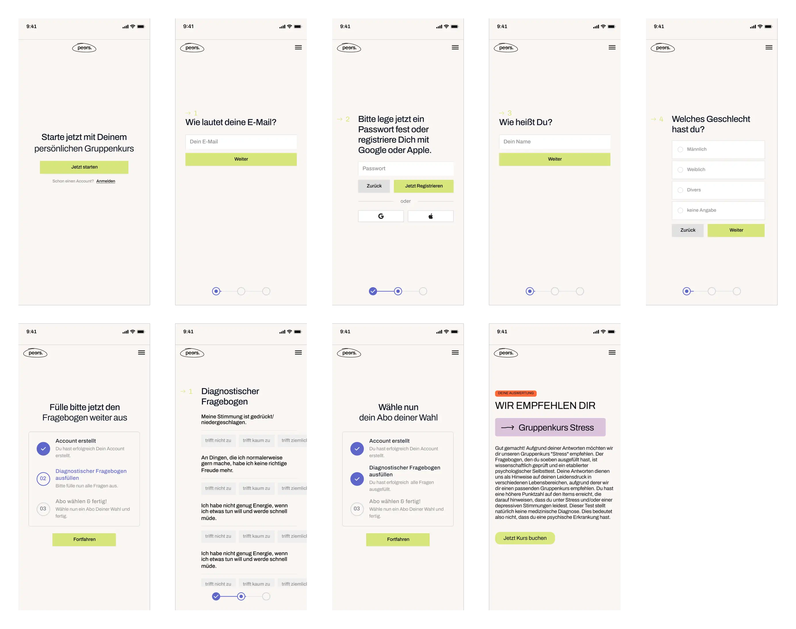
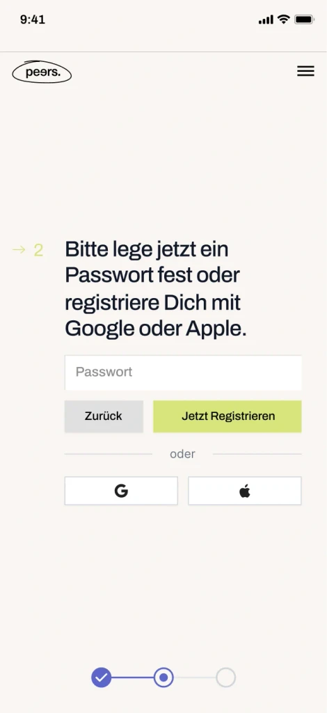
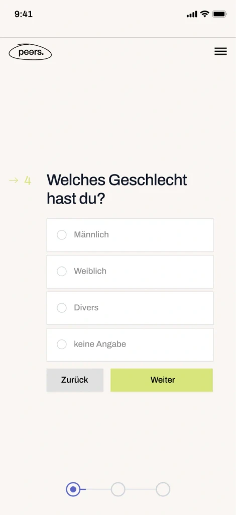
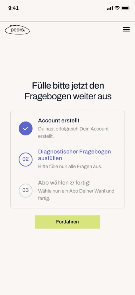
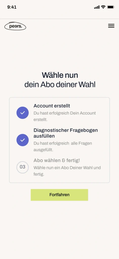
Main pages of the new designed Onboarding
Research & creation of the new user flow
After analyzing drop-off rates and conducting extensive research, including user interviews, I worked closely with our team of psychologists to understand the onboarding challenges from the perspective of mentally unstable individuals. This comprehensive approach helped us gain valuable insights into user needs and expectations.
Handpicked research collection
With this understanding, I sketched out a new onboarding flow using Miro, which later transitioned to FigJam for further refinement. My focus was on integrating all the insights and feedback gathered during the research phase to create a streamlined and empathetic onboarding experience. This new design aimed to address the complexities of the previous process while ensuring that users felt guided and supported throughout their journey.
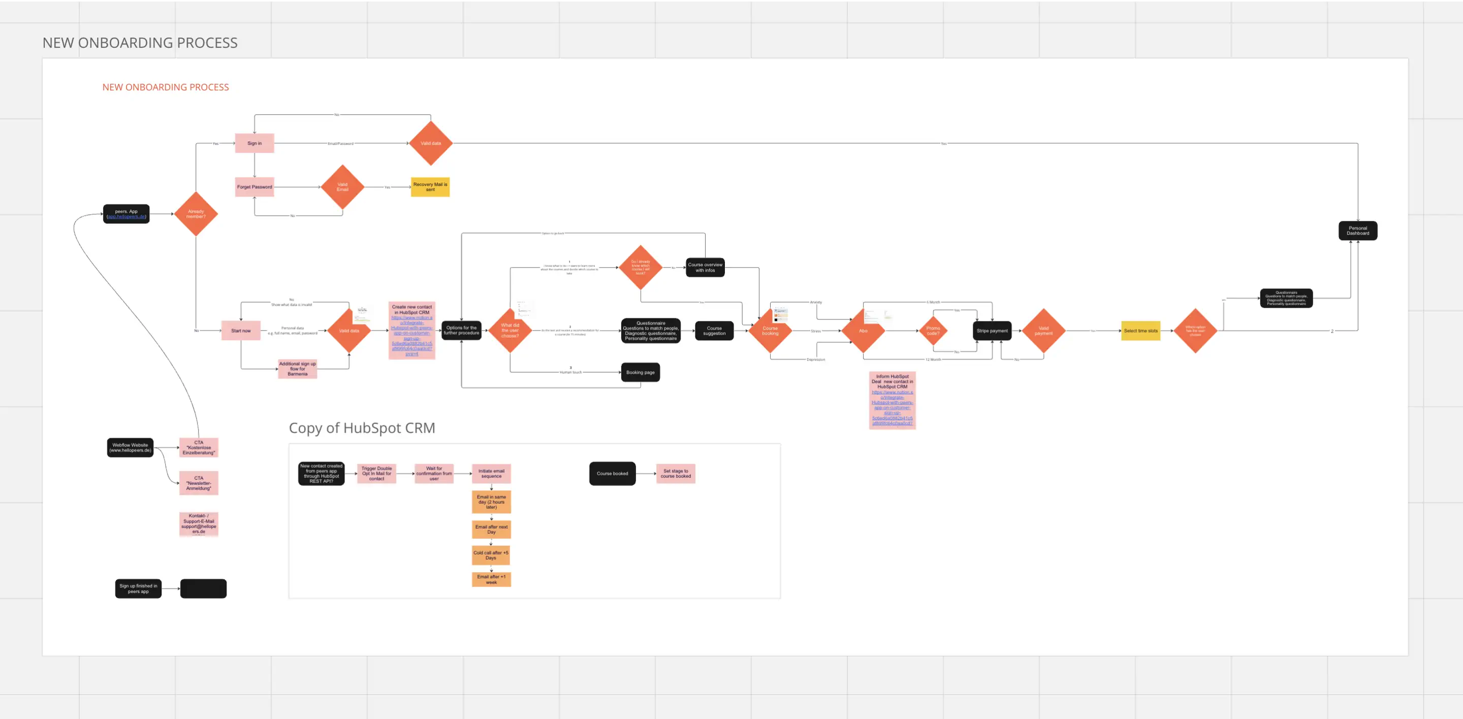
Flowchart of the new Onboardingprocess
Design of the new user onboarding
I began by creating wireframes and then designed the complete user onboarding experience in Figma. It was crucial to blend our requirements with established UX principles to make the complex onboarding process as pleasant as possible for users. Throughout the project, we iteratively refined the process, making numerous adjustments based on feedback and testing. Ultimately, I developed a comprehensive prototype in Figma to ensure a smooth and effective handoff to the development team.


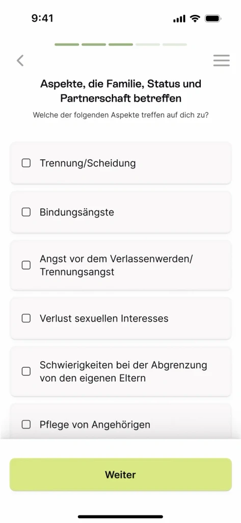


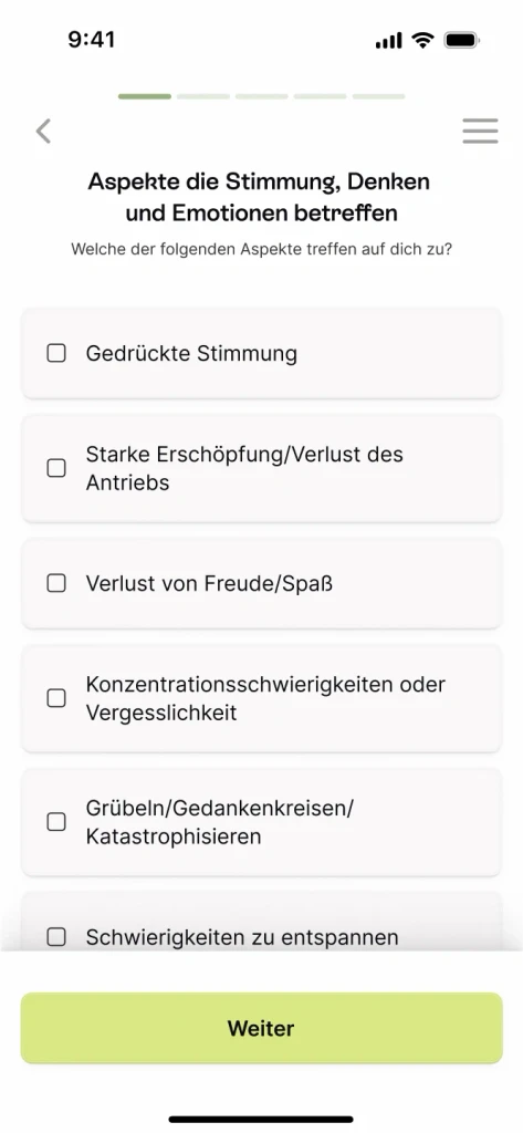
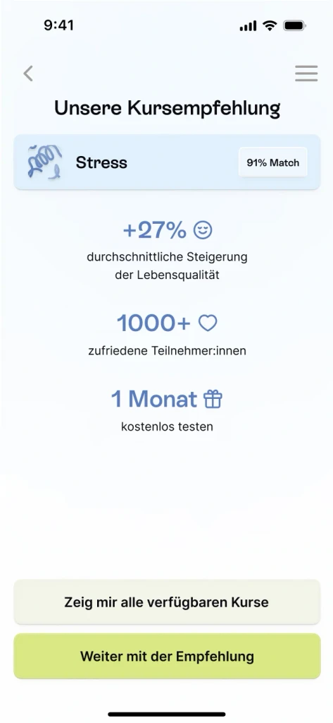


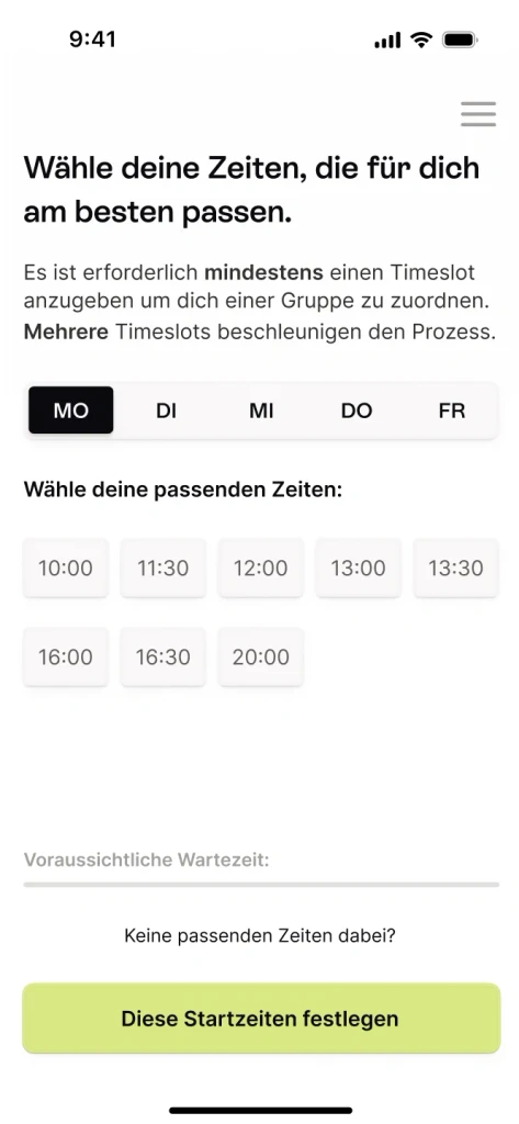
Main pages of the new designed Onboarding
There were, of course, significantly more pages designed to capture all potential user flows.
All steps + Prototyp in Figma
Drop-off rates analysis & comparison
After releasing V1 of the new onboarding process, we continuously monitored drop-off rates and user behavior. This ongoing analysis allowed us to make various adjustments and optimizations to further enhance the user experience and address any emerging issues.
Subsequently, we conducted a drop-off analysis to compare the corresponding pages from the old and new onboarding processes. This comparison enabled us to identify improvements and areas that still required attention, helping us understand the impact of our redesign and further refine the onboarding experience.
Comparison of the first 3 steps:
Onboarding > Start page
100%
——
> Create Account - Email
72%
27,56% dropped off
> Create Account - Password
47%
34,72% dropped off
Before - 53% of all users dropped off in the first 3 steps
Onboarding > Start page
100%
——
> Name
95%
04,89% dropped off
> Welcome
94%
02,63% dropped off
After - only 6% of all users dropped off in the first 3 steps
We moved the account creation step significantly further back in the onboarding process. Our analysis revealed that asking users to create an account immediately, without offering any value or giving them an idea of what to expect, led to a high drop-off rate in the initial steps. By delaying this request, we aimed to build user interest and engagement before asking for a commitment, thereby enhancing the overall onboarding experience.
Comparison of the step "Create Account":
> Create Account - Password
47%
34,72% dropped off
> Create Account
75%
09,59% dropped off
Comparison of the payment page:
> Payment page / Stripe
2,7%
74,64% dropped off
> Payment page / Stripe
32%
20,50% dropped off
Conclusion
Restructuring and redesigning the onboarding process was a challenging task due to the numerous regulations associated with being a medical product and the collaborations with health insurance companies. These factors made it particularly difficult to create a user-friendly experience. However, in the end, we are very satisfied with the new process. We achieved our conversion goals and successfully conveyed our expertise to users, providing a professional initial assessment to recommend the most suitable course.